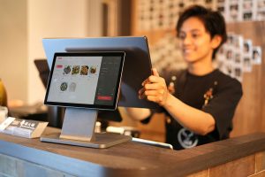
The landscape of POS and dashboard design is evolving rapidly. What worked in 2025 won’t cut it in 2026. Today’s users expect interfaces that not only look modern but actively adapt to their needs, tell compelling data stories, and provide seamless interactions.
Whether you’re a designer selecting the perfect template, a front-end developer building custom solutions, or a shop owner upgrading your POS system, understanding these trends will help you make smarter decisions.
Let’s explore five game-changing approaches that are defining exceptional POS and dashboard experiences in 2026.
1. AI-Powered Personalization: Interfaces That Learn
Modern dashboards are no longer static. In 2026, AI adjusts layouts, highlights key insights, and adapts to each user’s habits.
Cashiers, managers, and owners don’t need to search through layers of metrics. The interface brings forward what matters most — low-stock alerts during peak hours, trending items, or end-of-day summaries.
Platforms like Netflix refined intent-prediction models. In UI terms, this means dynamic cards, shortcuts that adjust to context, and layouts that shift based on behavior patterns.
Design tip:
Use modular components. Your layout should be flexible enough for widgets to resize, reorder, or reprioritize automatically.
The impact:
Less cognitive load, faster decision-making, and smoother workflows — especially in busy retail environments.
2. Liquid Glass Aesthetics: Clean, Depth-Rich Visuals
A major visual trend for 2026 is “liquid glass” — a blend of translucency, depth, and soft motion.
Why it works:
It adds clarity without clutter. With POS dashboards containing dense data, layered transparency helps build visual hierarchy and makes screens feel modern.
What you’ll see more of:
Soft gradients, frosted glass cards, smooth shadows, subtle reactions to touch or movement.
Design tip:
Keep accessibility in check. Ensure contrast stays strong, especially for users working in bright retail settings.
3. Data Storytelling: Let the Interface Explain the Insights
Dashboards are shifting from static charts to interactive stories that guide users through insights.
The shift:
Instead of showing plain numbers, modern dashboards explain the “why” behind them.
Example:
A restaurant dashboard might show:
• Lunch rush peaked at 1:30 PM
• Best-selling item: Signature burger (23 sold)
• Weekend sales grew 15% vs last month
Animated flows, contextual highlights, and progressive drill-downs.
4. Bento Grid Layouts: Organized and Easy to Scan
Bento grids have become a key layout pattern for dashboards in 2026.
Why it works:
Different tile sizes naturally guide attention. Larger tiles show primary metrics, while smaller ones fit quick actions or summaries.
Where it’s used:
Apple, Samsung, and leading SaaS dashboards.
For POS systems:
• Today’s revenue → large tile
• Inventory warnings → medium tile
• Quick actions → compact buttons
• Recent transactions → scrollable list
Design tip:
Keep spacing consistent and give each tile one clear purpose.
5. Minimalism Enhanced With Microinteractions
Minimalism isn’t going away — it’s becoming smarter.
What microinteractions do:
They confirm actions, guide attention, and offer quick feedback without creating distractions.
Examples:
• A smooth tick animation after a successful order
• A slight button scale on tap
• A pulse when inventory hits reorder levels
Why POS systems benefit:
Speed and clarity reduce errors in busy environments.
Design tip:
Use motion with intention — too much feels chaotic, too little leaves users unsure.
Bringing It All Together
These five trends work best when combined:
AI personalization + liquid glass visuals + bento layouts + data storytelling + thoughtful motion = a modern dashboard experience that feels intuitive and powerful.
For template buyers:
Look for templates that support these patterns — not just pretty screens.
For developers and SaaS teams:
Use these trends as a roadmap for your next upgrade.
For shop owners:
Evaluate interfaces based on adaptability and clarity, not just features.
Why DreamsPOS Already Fits 2026 Standards
Our templates include:
✓ Flexible components ready for AI-driven layouts
✓ A modern look that stays readable in real work environments
✓ Data storytelling elements for faster insight
✓ Responsive bento grids that adapt across devices
✓ Smart microinteractions for smoother workflows
DreamsPOS templates are built to help you design faster, hand off easier, and deliver modern experiences your users will enjoy.
Explore DreamsPOS Templates →2026 is beginning a new era of interface design where functionality and aesthetics work hand in hand. By embracing AI personalization, liquid glass design, data storytelling, bento grids, and meaningful microinteractions, you’re not just following trends—you’re building interfaces that genuinely serve your users better.The future of POS and dashboard design is here. The question is: will your interfaces keep up?